elastomania.com
elastomania.com
challenges
- Designing a modern website, that will refer to the design of a 20-year-old game
- 3-day timeframe for creating the website design and new branding
- Working in the "game design stylistics", that was completely new to me
my contribution
- I was the only designer in a small team.
- I worked on implementing the website with one developer, and also coded some parts of the website.
tools
- Photoshop, Illustrator, Figma
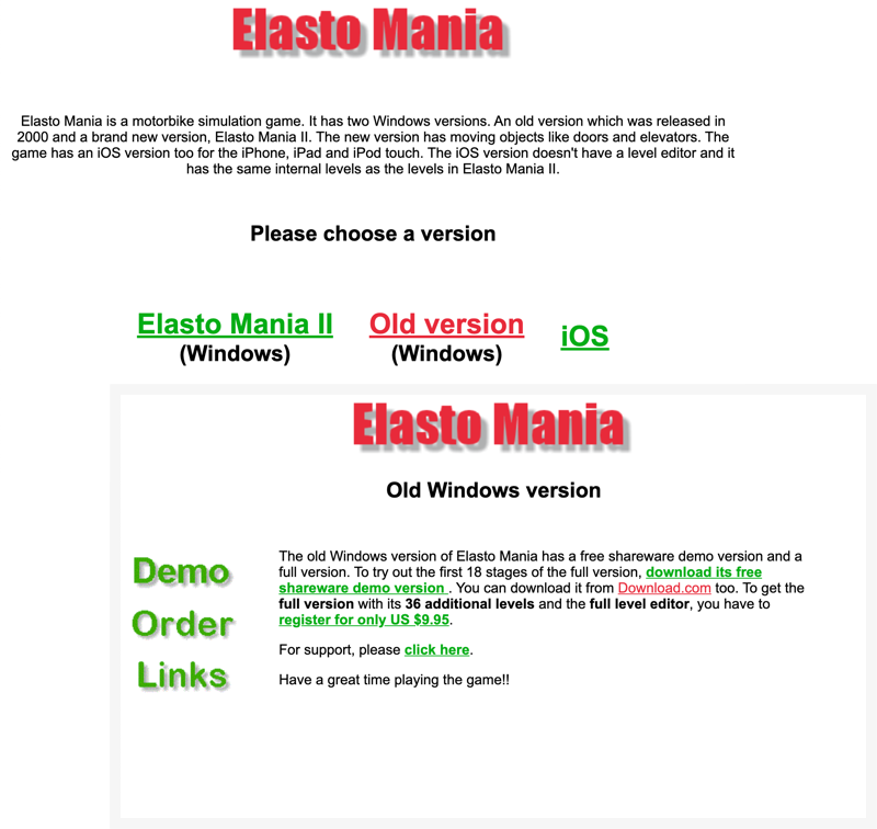
analysing the existing website
-
The design is not referring to game's visual style. It’s also hard to understand what is this website representing.
-
“The old version” of the game is still the most successful but the website is guiding the user to start with Elasto Mania II, which is far less popular.
-
It’s hard to find the payment form. It takes 3 clicks and going through some inline links to find it. Also, the payment forms don’t look trustworthy.
- The game has a great, active community organizing events but there is no clear information about it.
learnings from the competitors
Since I haven’t designed for the game industry before I looked at the competitors of Elasto Mania and some of the old games, to develop an understanding of design patterns in that field.

Dark theme
Most gaming websites use dark themes and lots of visuals from the game.

Bold typography
Very distinctive, geometric, bold typography appears within the gaming websites.

Videos
Videos showcasing the game flow are an essential part of most gaming websites.
what makes elasto mania, elasto mania?

The biker
The main character from the game.

Sharp edges
All maps are created using sharp-edged polygons.

Bright colours
The combination of neon green and dark blue is dominating in the maps.
first drafts & decisions made
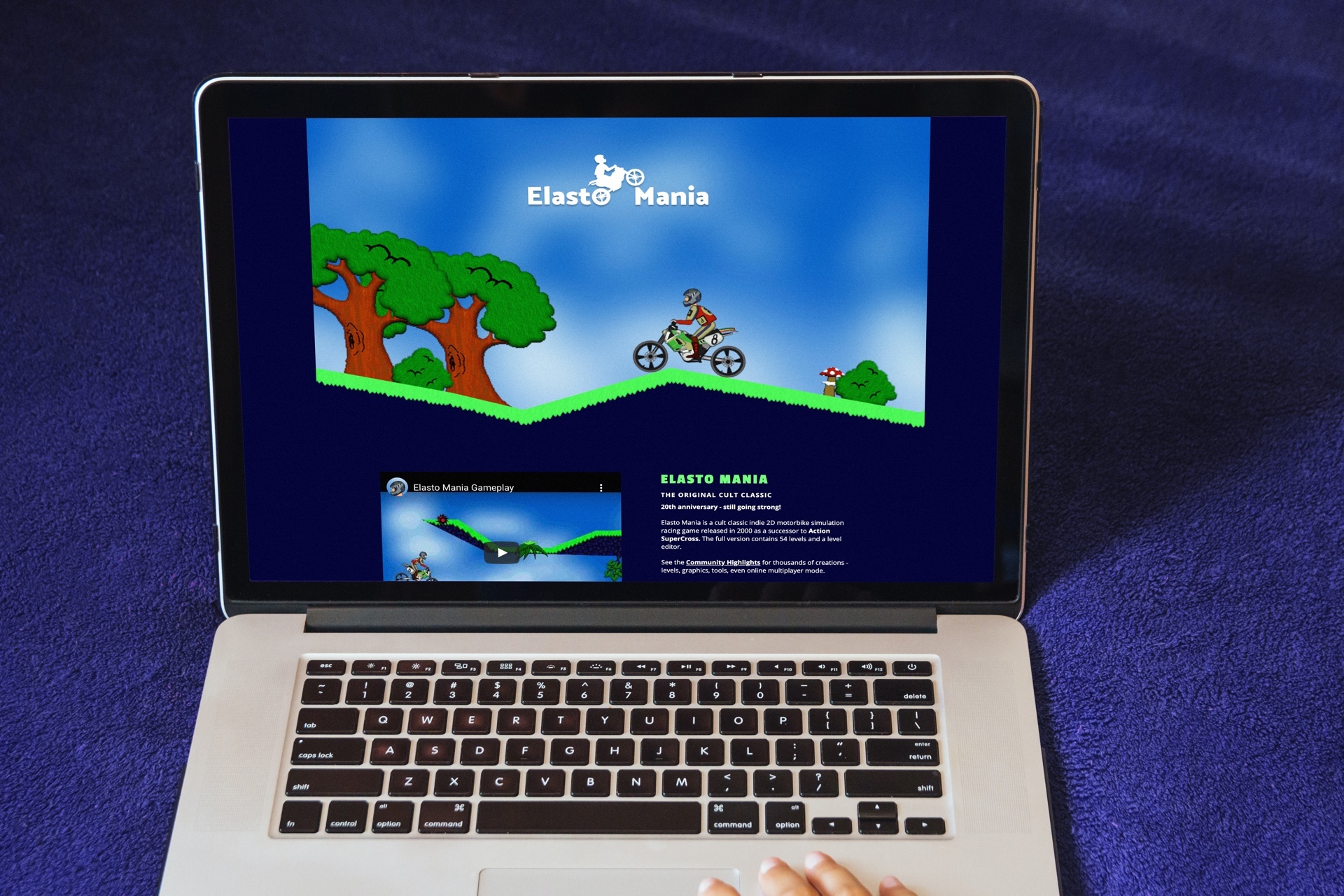
One page is enough. The existing website had separate pages for every game version with very little content, no hierarchy and too much text. All this information could fit on a single page.
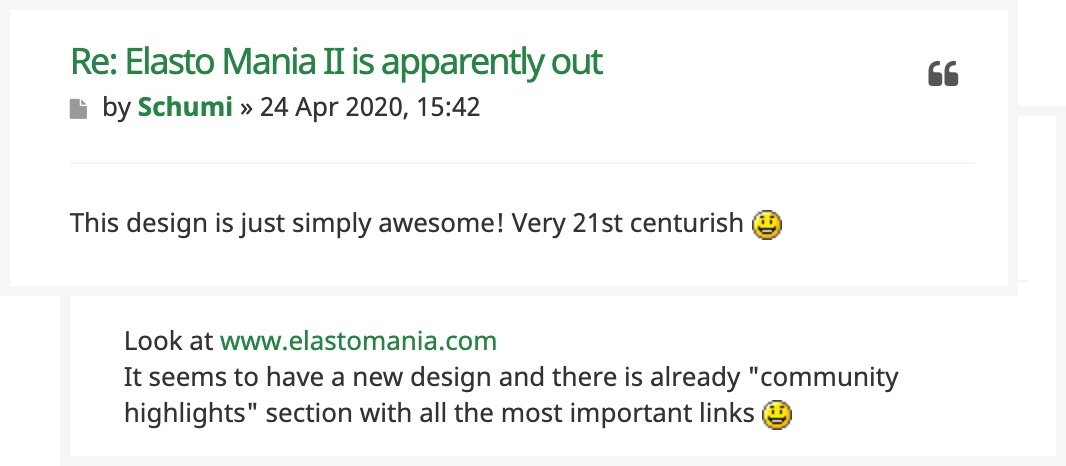
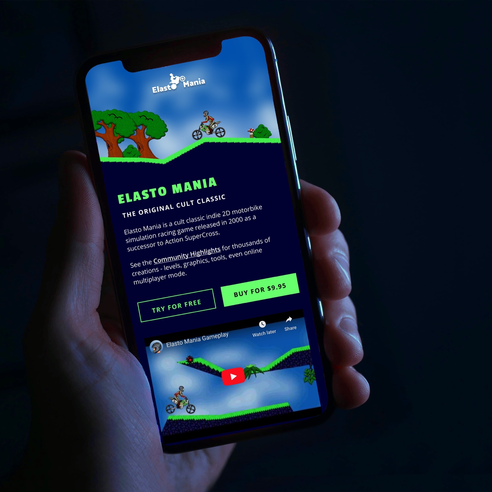
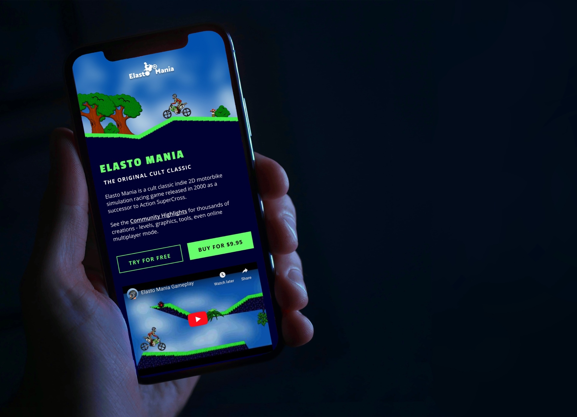
Highlight the most popular version. The oldest, but most popular version is on top and the website design is referring to its stylistics.
Videos for all versions. It makes it easier to understand the game, with previews next to each version within a single page.
Make the website design refer to the game. I used the neon colour and the sharp edges to refer to the game style.
Make it easy to buy the game. I placed visible buttons to purchase the games straight from the home page.
Highlight the community. A great advantage of Elasto Mania is its active community. I created a section with links to various forums, game battles and unofficial patches.
New logo. I quickly developed the logo, by tracing the bike from the game and combine it with the name, to give the current logo more identity.

final design
the results
It is still too early to say if and how the new design influences sales. However, the redesign was positively received among the existing users.