Launching documentation centre
challenges
- Setting up priorities to build the website in 2 weeks.
- Bringing all sources of documentation (such as PDFs, presentations and emails) into one space, while maintaining ease of use.
solution
An MVP documentation page, that replaces the current system. The new website is WordPress-based, so non-technical project members can edit the content with ease as well.
key learnings
A very tight schedule made me prioritize the absolute minimum to launch. It is better to go live with something and improve it later, than nothing at all.
my contribution
tools & languages
timeline
strategy - why are we doing it?
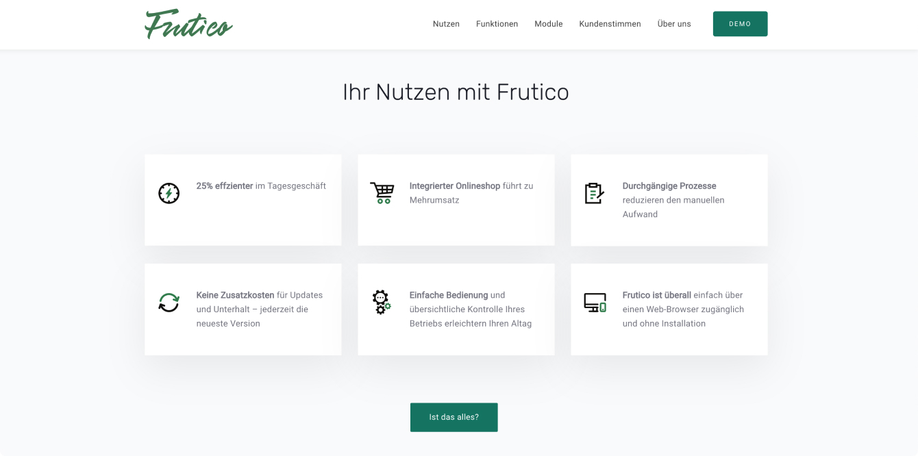
Frutico is a business management software for the fruit and vegetable industry. It helps specialized users carry out their everyday work tasks.
We personally guide our customers through the tool and give them updates on new functionality.
As Frutico is growing we need space to explain the new functionality, with examples of how to use it. Also, future Frutico customers will need a single source of documentation.

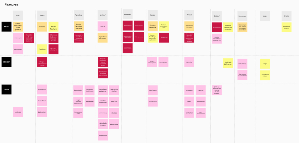
scope - what can we make in 2 weeks?
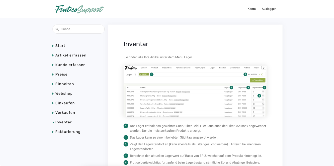
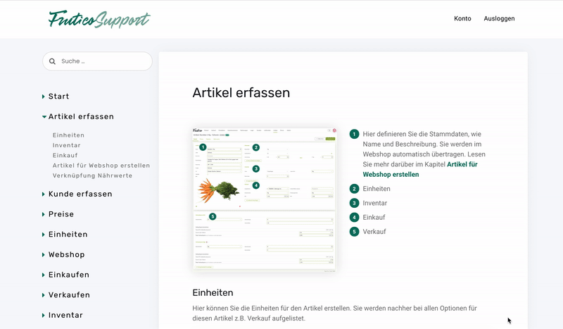
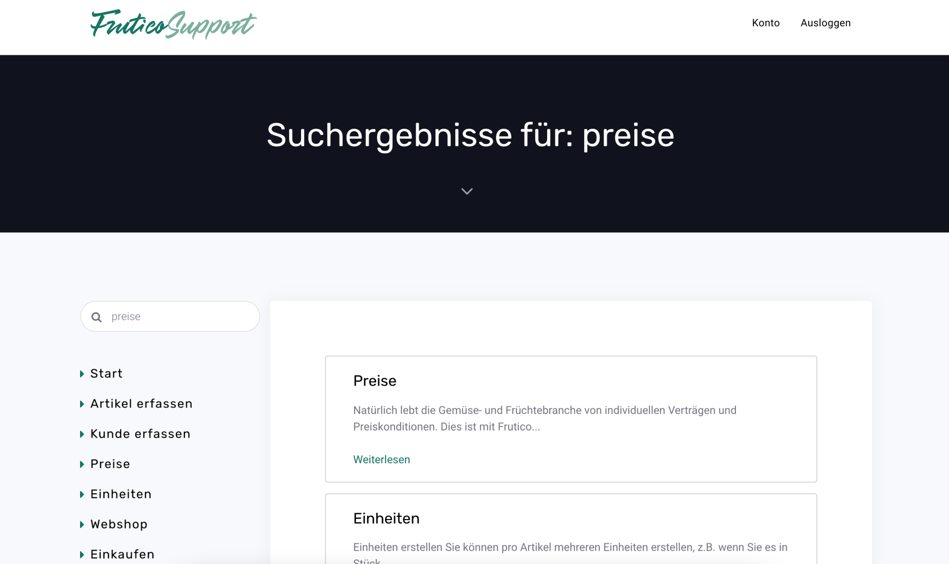
A large part of this project was to create the content for the documentation page. We started by mapping out content that we already have. I went through emails, marketing videos and presentations, and listed already described functionality.
I then added other topics, grouped everything by themes, and sorted by importance. In the end, there was a list of content for the first release.
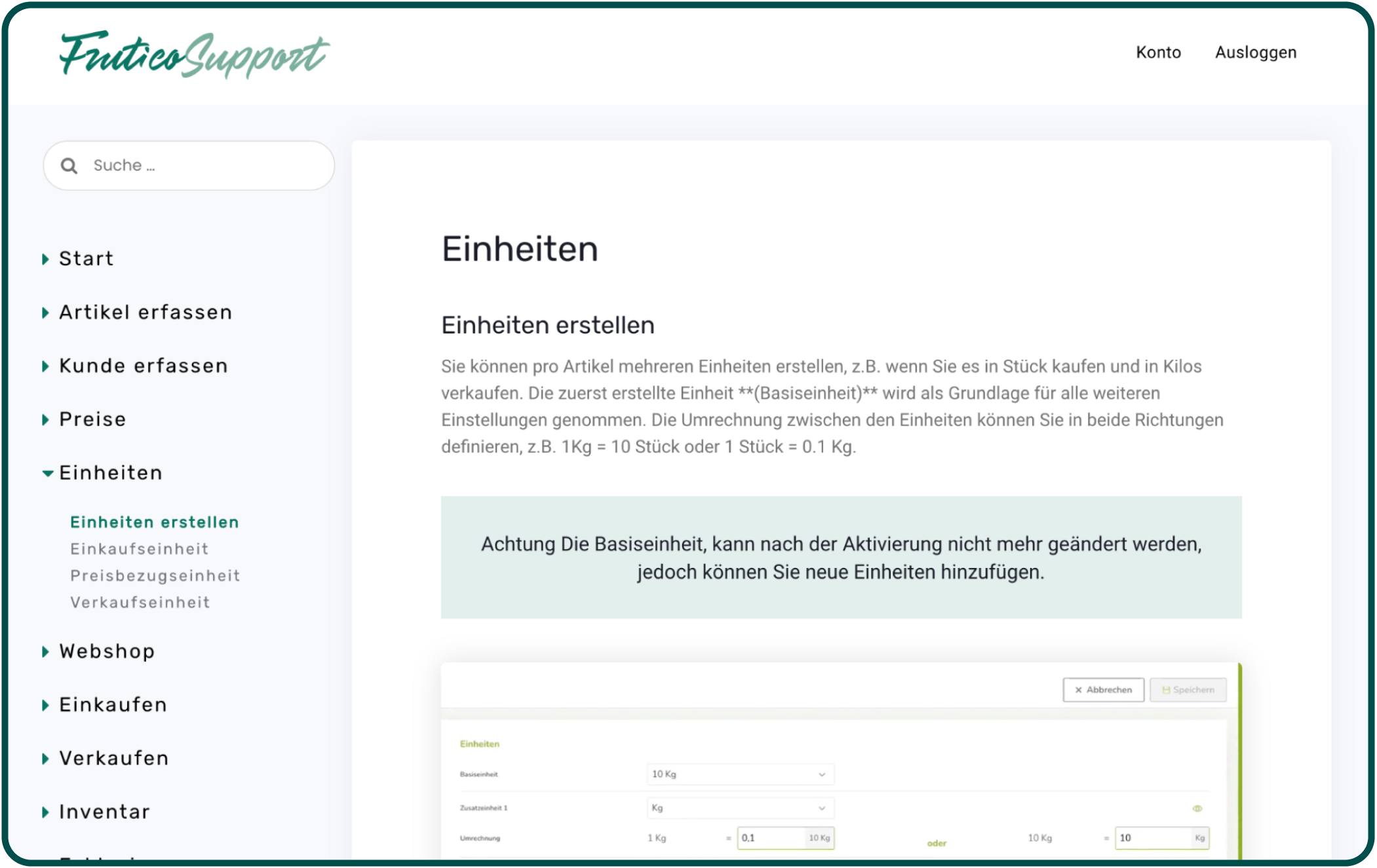
structure - how to organise information?
Information Architecture was the part with the most unknowns and hardest to test. Here are the main challenges:
challenge #1
The place where people might be looking for unknown information depends a lot on the context they are in.
approach
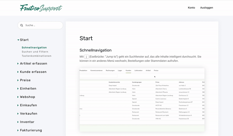
We grouped the information in the same way as in the product and linked related content to allow many points of access. Also, the search functionality was crucial.
challenge #2
Testing requires participants who don't know the product yet but have industry-specific knowledge.
approach
I tested the structure with a new team member, who is an industry expert but didn't know our tool yet. We also decided to launch the website as a pilot project for a new customer, to get feedback.
skeleton - a simple template
When I joined the project, we already had high-fidelity wireframes made by our apprentice a few months back. We used it as a starting point for visual design and adjusted them to fit the reduced MVP functionality.
Since people creating content in the future will not be designers, we wanted to provide a simple template. It will allow them to easily edit the website.

surface - a support page that fits the main product
The visual design is very minimal, fitting the main product. Also, while designing the support page I realised that on the main product page we used different shades of green and proposed to unify them.