driving platform redesign
context
DoiT is a cloud company building an analytics tool. The tool is used internally by DoiT Account Managers, Cloud Architects and externally by CTOs and Engineering managers.
challenge
How can we improve our analytics tool to increase adoption among external users?
my role
I was the sole designer on this project, working on an end-to-end design process, closely collaborating with the PM, engineers and other stakeholders.
solution
We broke down the problem into solvable chunks and designed data-driven solutions for each problem. We addressed user problems, by restructuring the page using existing design system components.
result
We gradually released more than 20 enhancements, and received positive feedback both from external and internal users. Finally, we also observed increased adoption, but it was too early to determine a clear correlation.
my approach
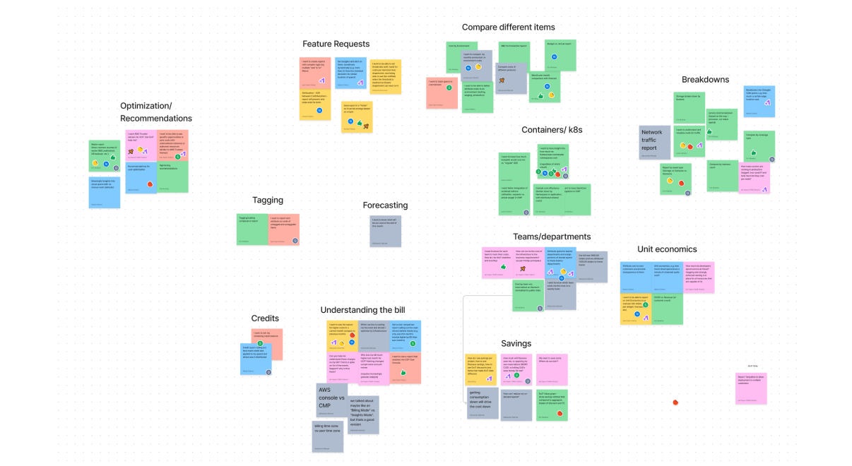
designing alignment
Design is a team sport, and everyone has different perspectives. I involved multiple stakeholders in getting diverse perspectives and creating a shared vision.
breaking down the elephant
Instead of starting a complex, scary redesign project, I proposed gradual improvements using existing patterns. We used a data-driven approach to target each opportunity. Small changes also meant more straightforward implementation & fewer bugs in the making.
design for change over time
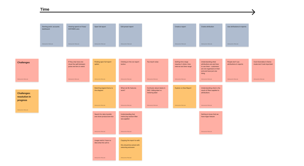
As users become familiar with our Cloud Analytics, they start using more and more features. We mapped their journey with our platform over time and identified opportunities to improve user experience throughout their journey.
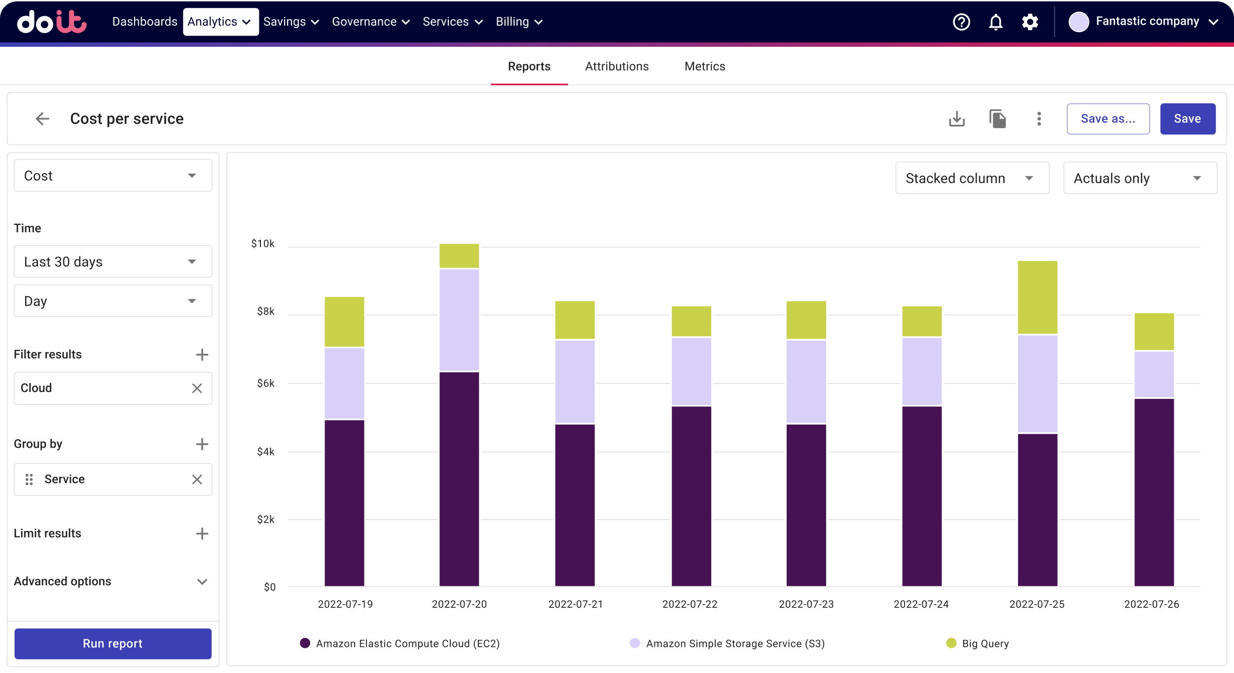
reducing interface complexity
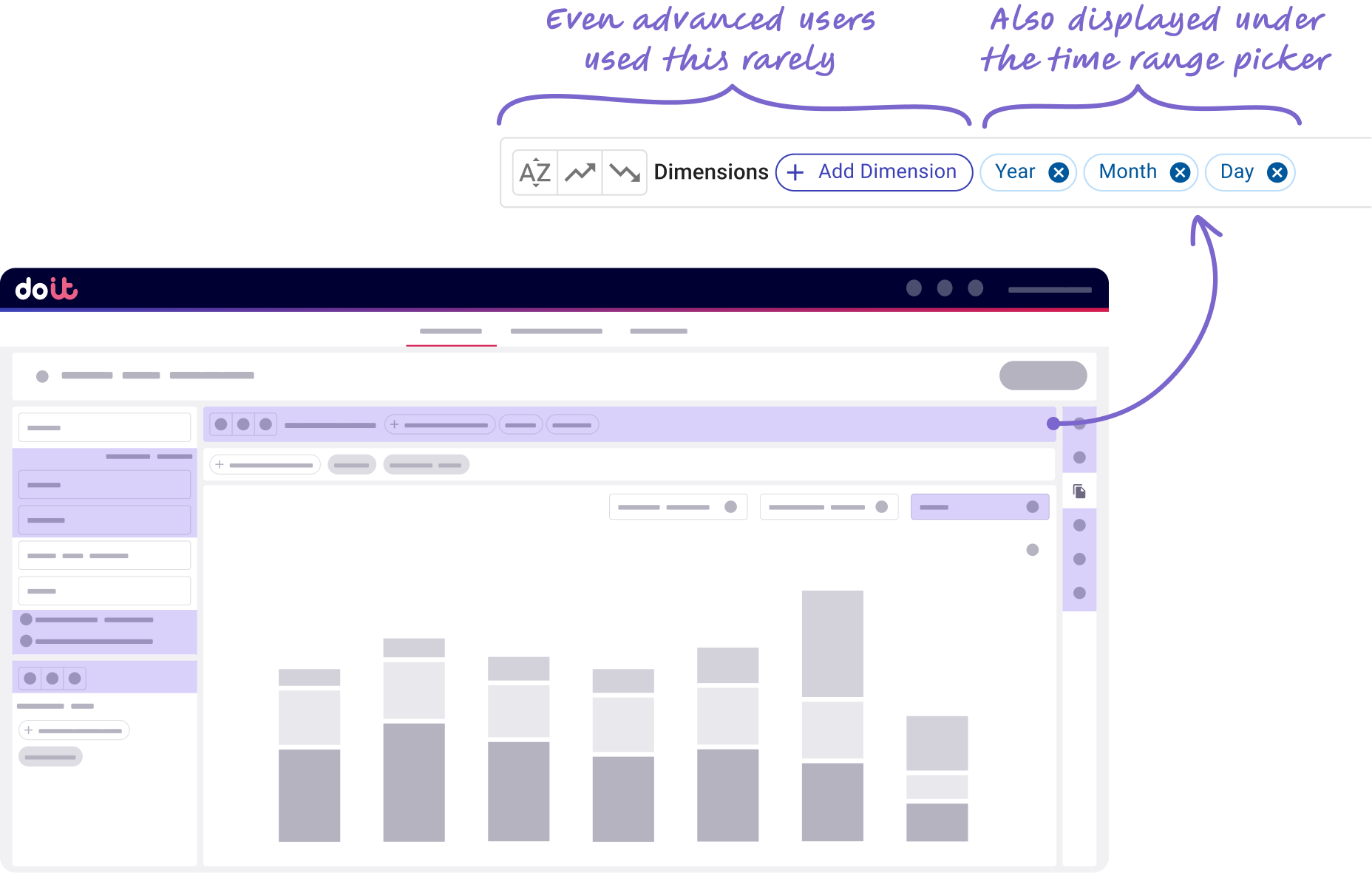
there is too much noise on the screen
We analysed the quantitative data on what features are rarely used and further evaluated use case for these features.
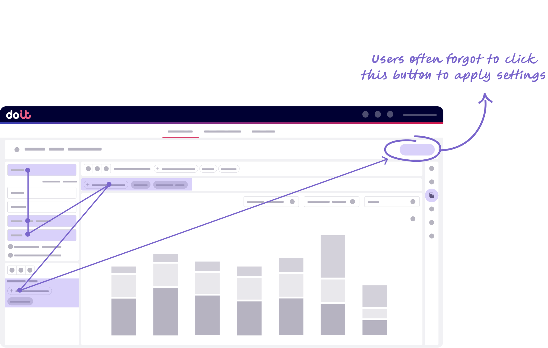
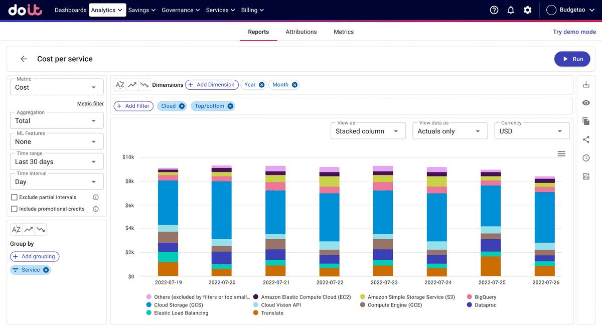
elements needed to create a report are hard to find
We created a journey users follow when creating a report and realised that this journey was different from the natural reading order
my design approach
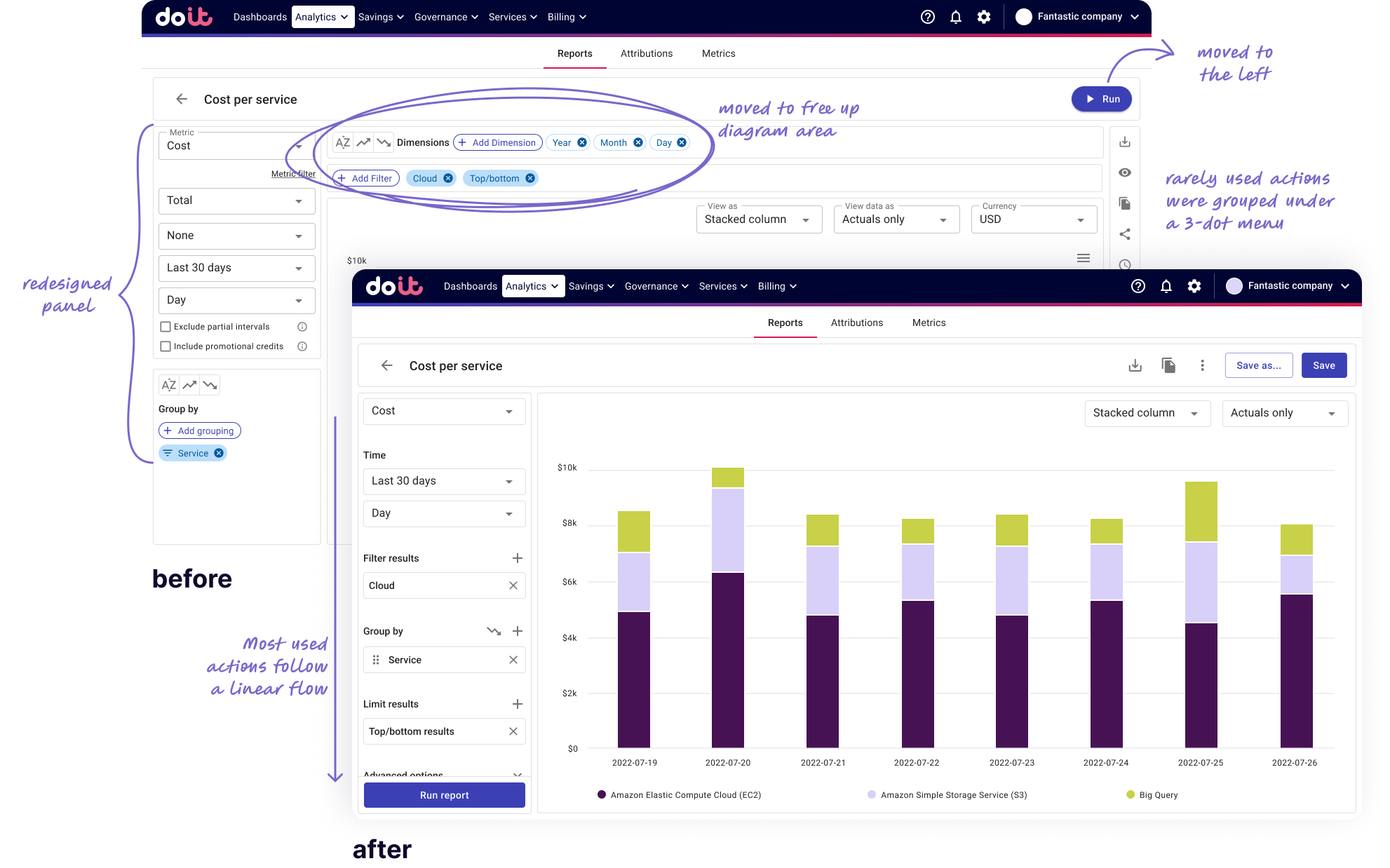
- Restructure the page using existing design system components
- Hide advanced features under a dedicated section
- Follow a logical path when creating report
optimising user journeys

Jane* is the CTO of a small startup. She logs in daily to the DoiT platform and looks at the default dashboards. When something unexpected happens, she wants to understand what caused the issue.
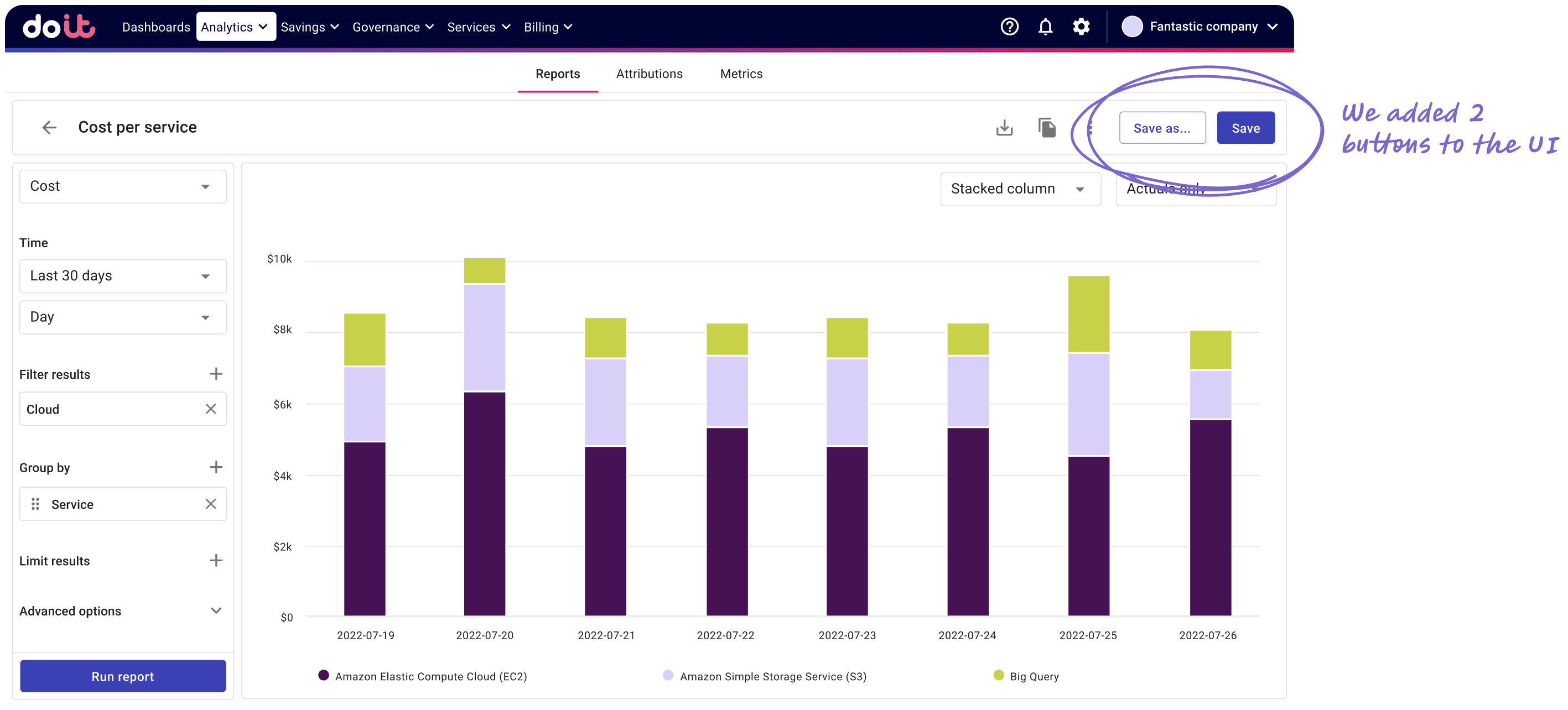
Before
Jane wanted to directly edit preset reports, to quickly identify issues with their infrastructure
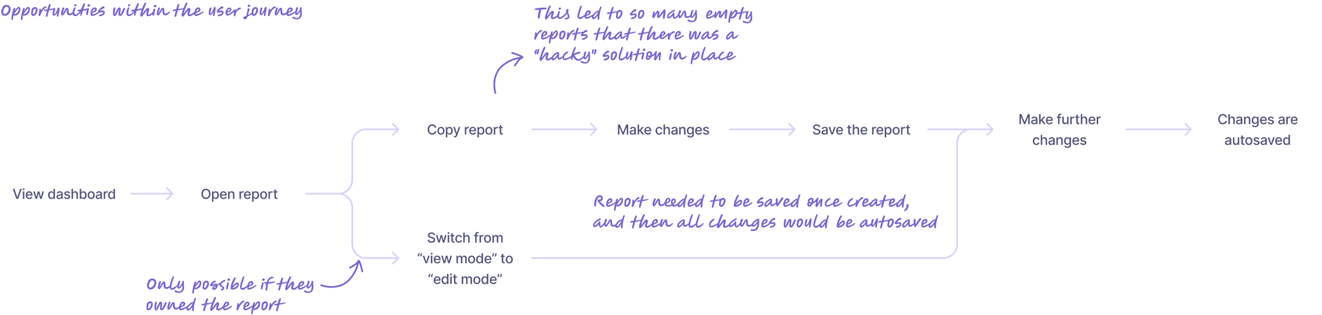
After
We impacted how the product worked, by switching from auto-saving to having a save button
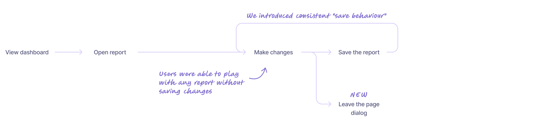
Result
On the first glance the change was simple but this had some consequences:
- We had to warn users when they were leaving the tool without saving
- We removed the edit and view mode