Designing a new B2B SaaS tool
my role
I was the first designer on the team to join at the start of the product. The current visual design is based on the foundation I’ve built. My responsibilities included:
- Planning UX activities and promoting UX best practices within the team
- Running workshops and communicating with stakeholders and developers
- Establishing visual language & design system
- Onboarding a junior designer to help with the workload
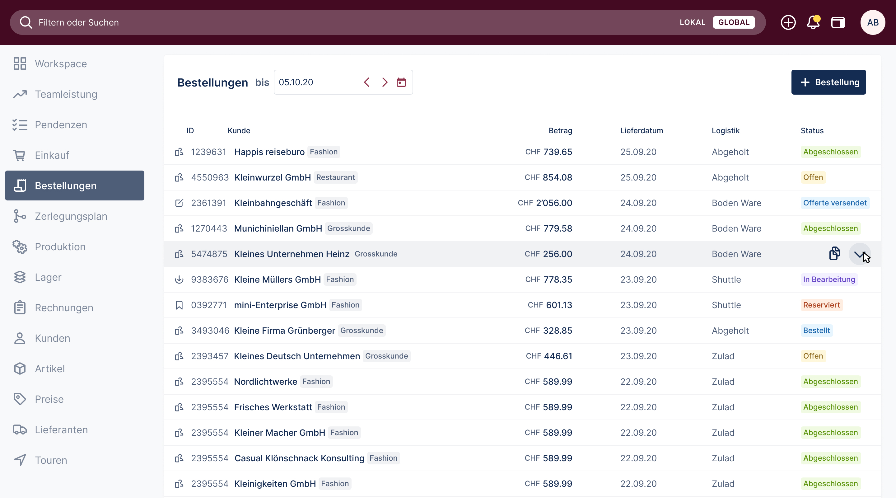
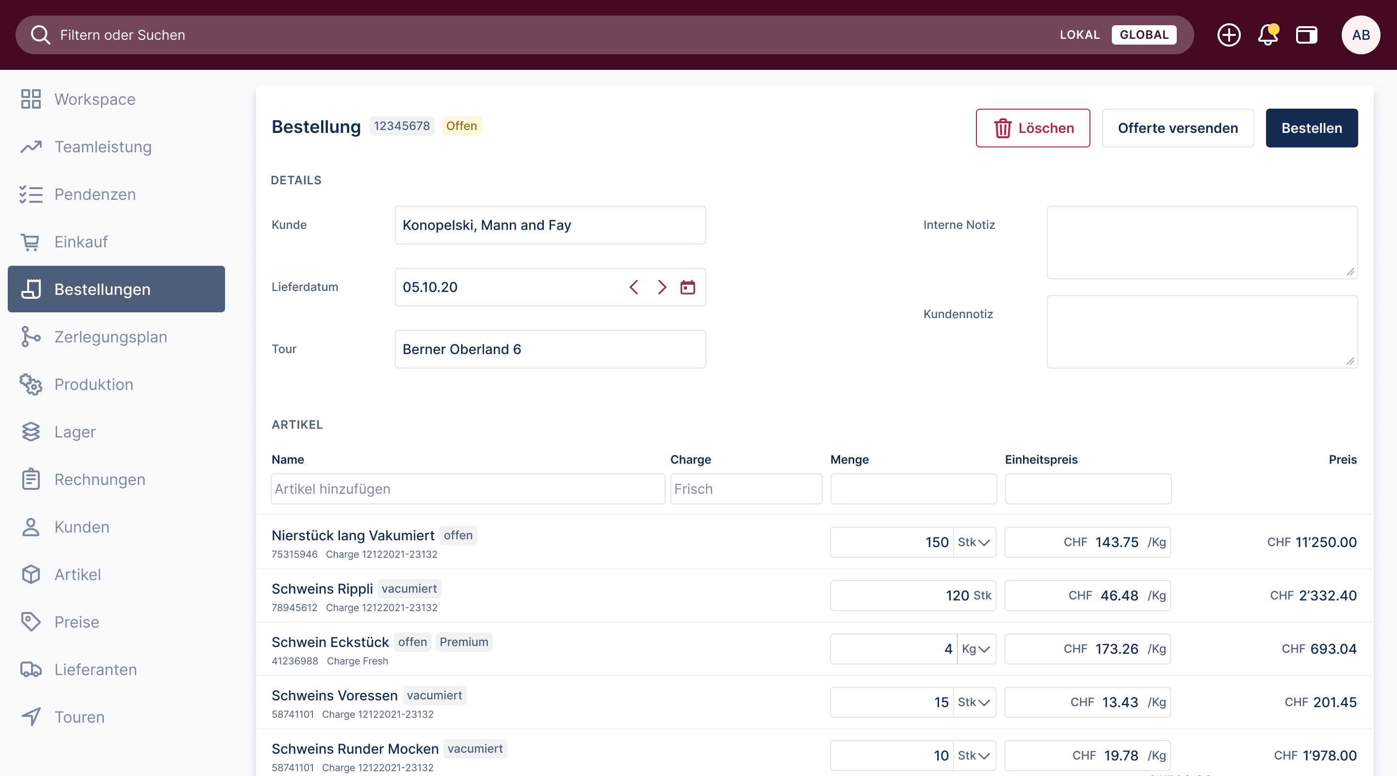
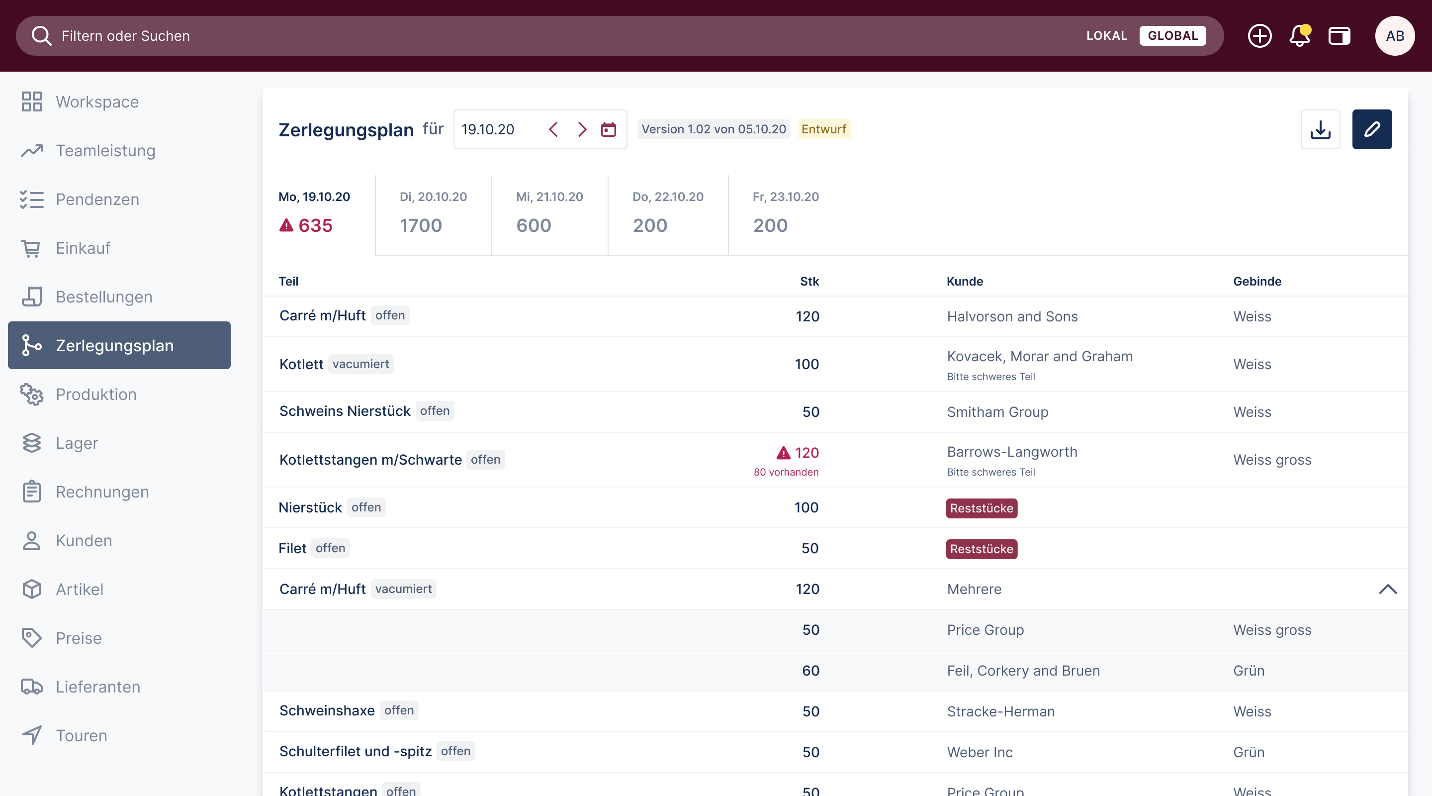
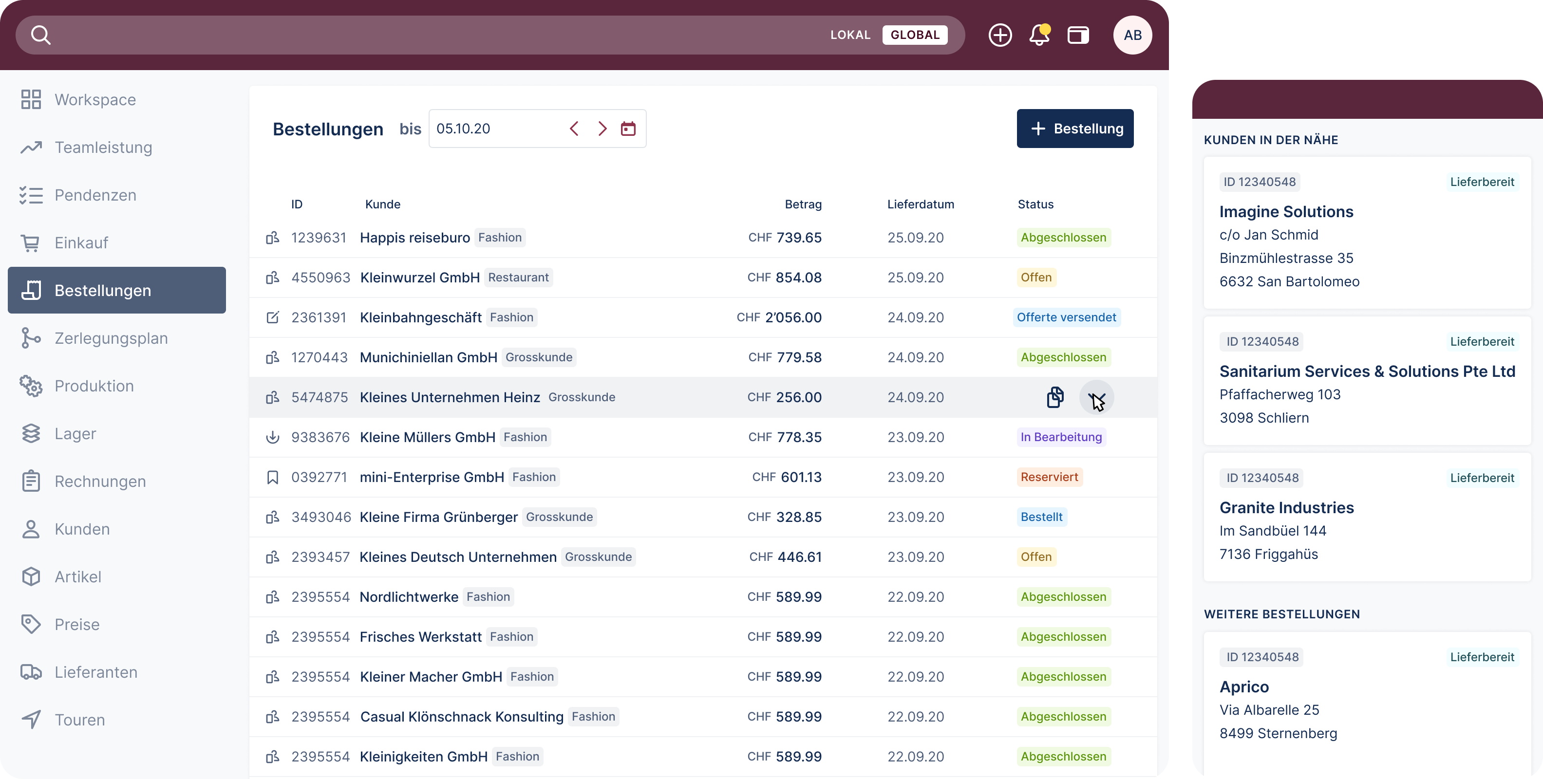
- Delivering designs for desktop, mobile, industrial touch screens and paper
the biggest challenge
It was my first time designing such a large, complex project from scratch. My biggest challenges were navigating through complexity and my lack of domain knowledge. On the other hand, being new to the domain allowed me a fresh approach and challenged established processes, which led to improvement.
key learnings
- Importance of establishing design culture. While working on Meatico, I was also the sole designer on another venture. Establishing a solid design foundation and promoting UX best practices helped the team move forward when I was gone while maintaining high quality.
- Co-creation is my new favourite way of working. Bringing other people into the process and getting feedback from non-designers helped us innovate and challenge existing concepts.
- Persistence is the key to success. Being persistent in showing the team the value of early feedback helped me establish a testing culture and iterate faster.
timeline
Dec 2020 — Dec 2021
mapping processes
As a small team of 5, we started by visiting the customer and roughly mapping the ecosystem of existing processes. We then zoomed into each process individually when developing different features.
As processes were carried out using legacy software, Excel spreadsheets, and paper, we focused on improving the end-to-end experience. I conducted multiple rounds of user interviews and contextual inquiries during this process, mapped various components, and tested early solutions.
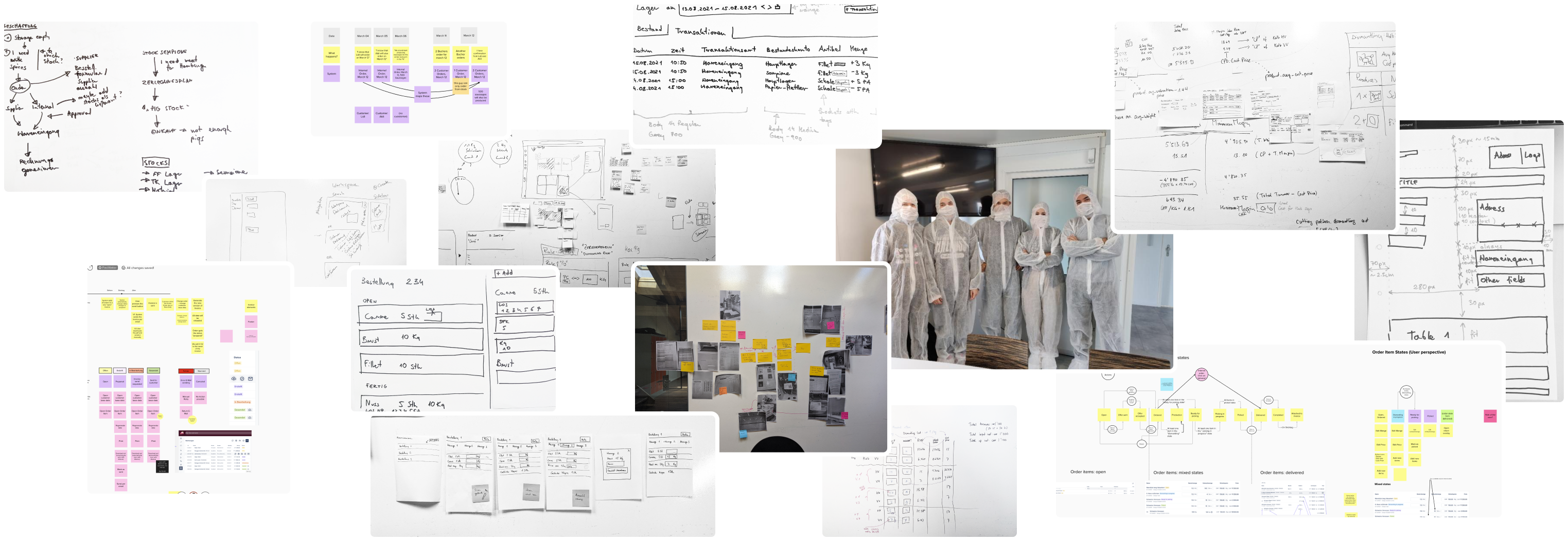
establishing testing culture
With no budget allocated for user testing, I began testing my concepts and prototypes with my colleagues. Through an ongoing demonstration of the value of user testing, I eventually established a biweekly user testing process.

designing for the right device
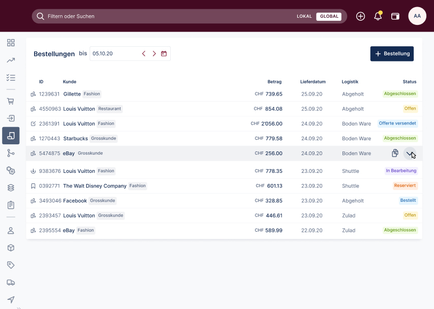
desktop first
Expert software is used on large screens. As all our office workers had larger screens, the challenge was to develop an interface that would be both legible on a 13-inch laptop and a 27-inch screen.
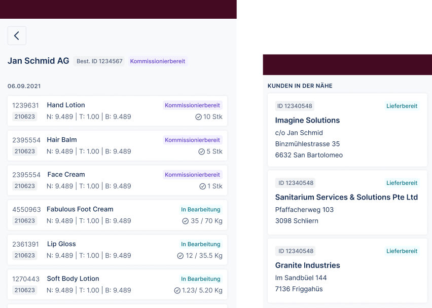
mobile & tablet
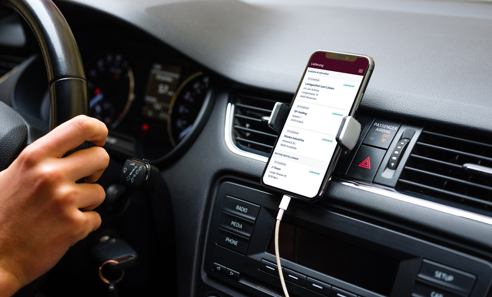
Understanding the processes was crucial to choosing the correct device. While office workers work on large screens, a driver could use the tool on his phone while delivering goods.
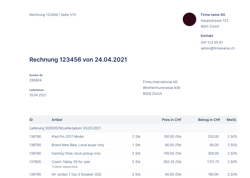
paper
In the time of technology, there was still a need for documents on paper (or PDFs). Among others, I analysed the Swiss envelope format to ensure the address fits within the address field.
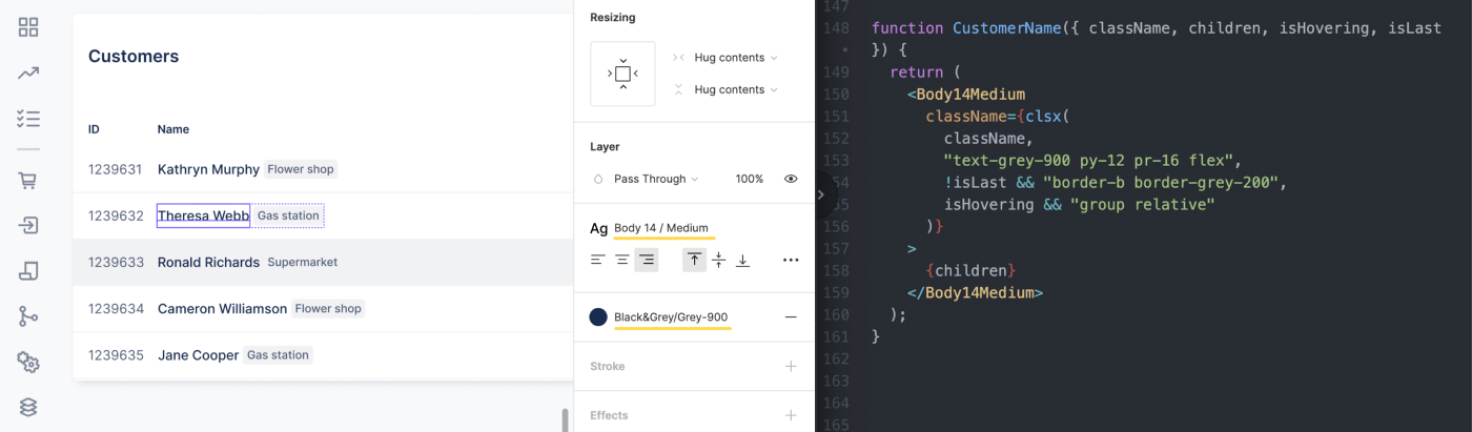
systems approach to design
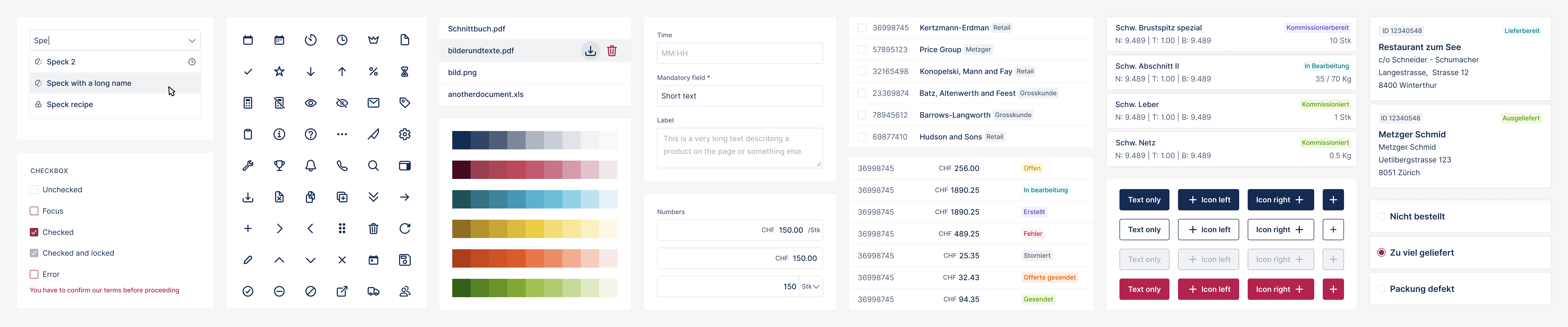
The interface of this highly complex tool needed to be simple yet highly scalable in the future. I developed a system of simple elements following atomic design principles.
To make our collaboration easier, together with the front-end lead, we aligned the naming of the elements in Figma and code. When a new developer joined the team, he was surprised by how easy it was to work with our system.
leadership
As our team grew, I had a chance to coach a junior designer, who eventually developed a mobile delivery system. It was great fun to brainstorm together and see how her designs evolve.
results